SUSANNA CALKINS, AUTHOR
Home
Lucy Campion Mysteries
A Murder at Rosamund's Gate
From the Charred Remains
The Masque of a Murderer
A Death Along the River Fleet
The Sign of the Gallows
The Cry of the Hangman
Death Among the Ruins
The Speakeasy Murders
Murder Knocks Twice
The Fate of a Flapper
Short Stories
Blog
News & Events
Event Photos
Archived Guest Posts & Interviews
The Roaring Twenties
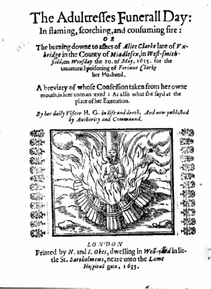
17th c. England
Writing Resources
Nonfiction
Home
Lucy Campion Mysteries
A Murder at Rosamund's Gate
From the Charred Remains
The Masque of a Murderer
A Death Along the River Fleet
The Sign of the Gallows
The Cry of the Hangman
Death Among the Ruins
The Speakeasy Murders
Murder Knocks Twice
The Fate of a Flapper
Short Stories
Blog
News & Events
Event Photos
Archived Guest Posts & Interviews
The Roaring Twenties
17th c. England
Writing Resources
Nonfiction

 RSS Feed